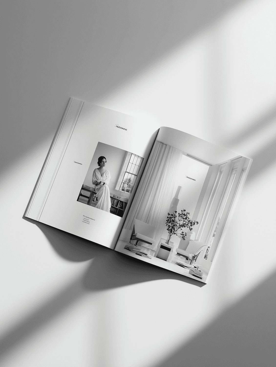
Kinetic Type Festival
An opening title sequence and poster series for a three day typography festival, where every letter was built to move.
- Client
- Kinetic Type Festival
- Role
- Title sequence & poster series
- Year
- 2023
The brief was one sentence: make the audience feel the festival before anyone speaks. The festival brings together type designers, animators and coders, so the opening had to work for people who notice every kerning pair.
One alphabet, two lives
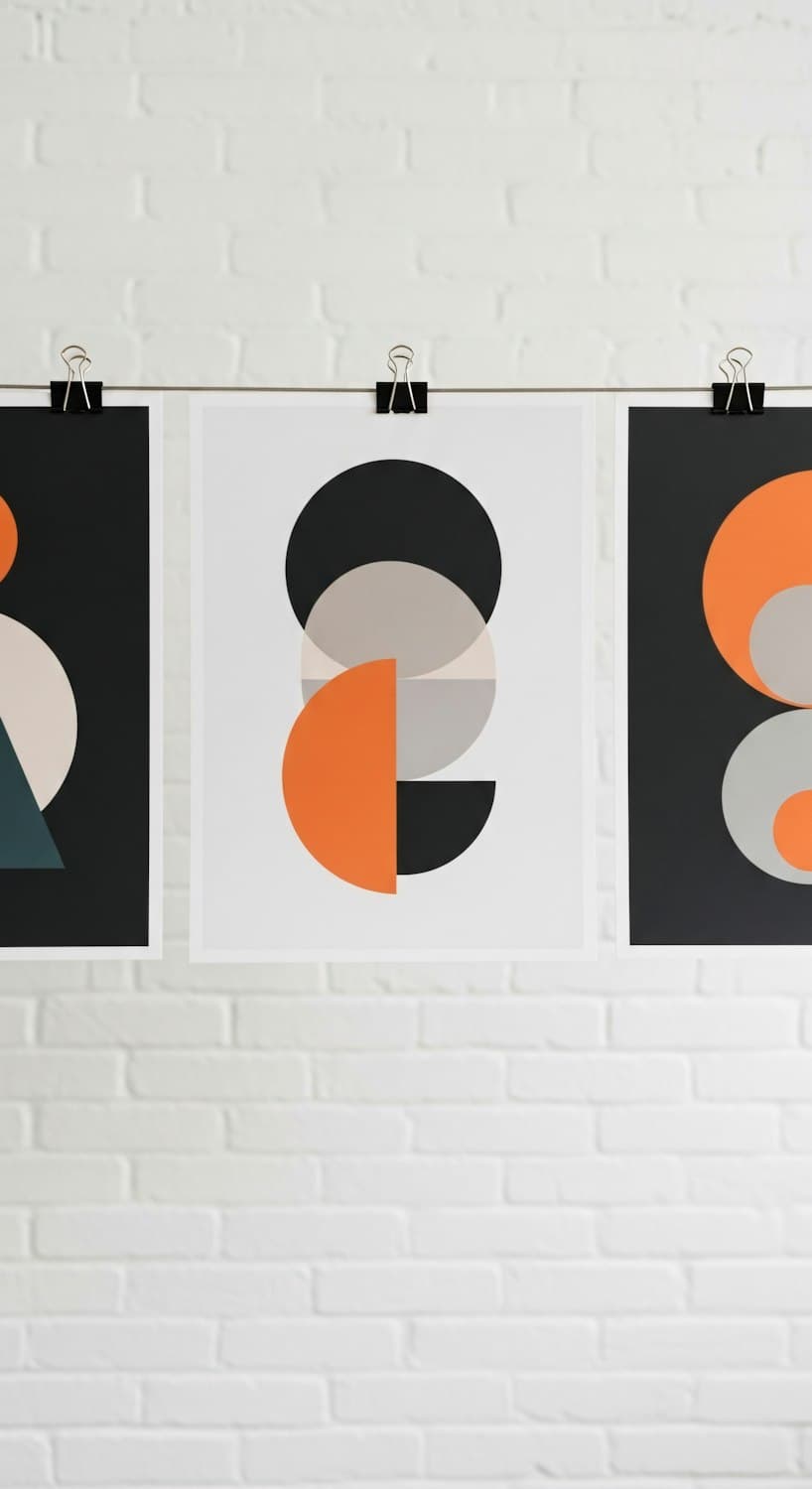
I drew a custom geometric alphabet where every letter is made from the same five shapes. On the posters the shapes sit still in tight compositions. In the title sequence they come apart and reassemble into the names of each speaker, timed to an original score.
- 01
Custom alphabet
Twenty-six letters and ten numerals built from circles, quarter circles and bars.
- 02
Title sequence
Three minutes of kinetic type, projected across a twelve meter screen.
- 03
Poster series
Eight posters printed in two colors, one for each day plus the speakers.
The sequence opened the festival to a standing ovation, and the poster series earned a Certificate of Typographic Excellence from the Type Directors Club.

Have a project like this in mind?
Tell me about it. I reply within two working days.