Field Notes Quarterly
A redesign for an independent interiors and architecture magazine, with a grid flexible enough for quiet essays and full bleed photography.
- Client
- Field Notes Quarterly
- Role
- Art direction & layout
- Year
- 2023
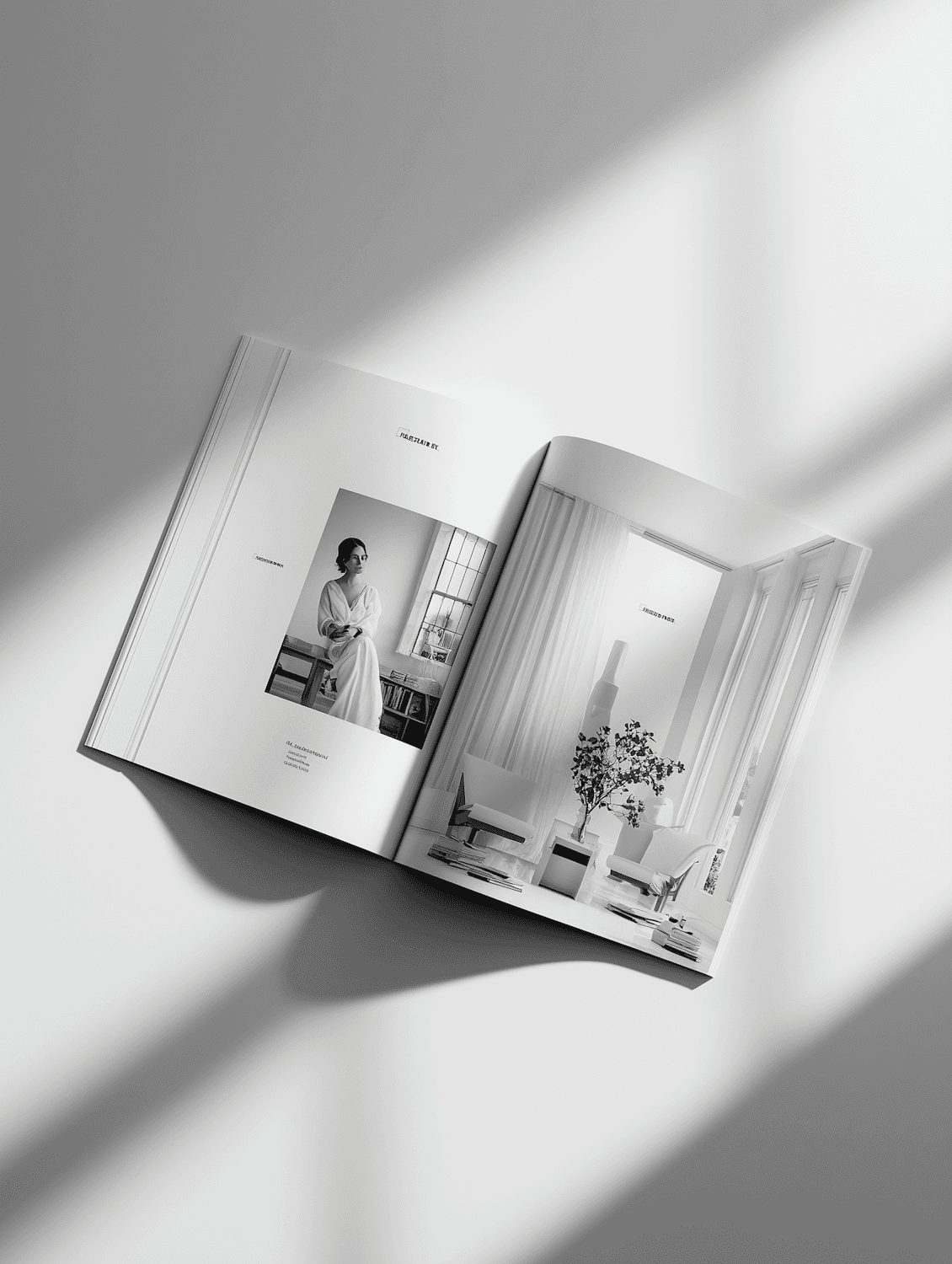
Field Notes had a loyal readership and a layout that had grown one exception at a time. The editors wanted the magazine to feel calmer and more confident, and they needed templates their small team could run without me.
A grid with room to breathe
I built a twelve column grid with a generous outer margin, paired a sharp grotesque for headlines with a warm book face for long reads, and gave photography the right to take over a spread whenever it earns it.
- 01
Grid and type system
One grid, two typefaces and four type sizes that cover every page.
- 02
Template library
Forty InDesign templates for features, interviews and listings.
- 03
Cover system
A masthead and cover layout that works with any photograph.
The team now produces each issue faster than before the redesign, and subscriptions grew by almost a fifth over the first year.

Have a project like this in mind?
Tell me about it. I reply within two working days.